Trend Report: Butter Yellow

If there is one recent trend I found surprising, it’s butter yellow. It has been stealing the spotlight recently and it’s a way to add a little extra sun-kissed touch to summer. Other than the obvious suggestion of butter, this color is soft, warm, and reminiscent of a sunny morning. The color is making it’s mark everywhere from runways to living spaces, but where did this delightfully sunny shade come from?
Why Butter Yellow?
“Butter Yellow” has been a color that has been around for awhile, but is experiencing a fresh revival - and for a good reason. It’s a shade that sits between the bold bright yellow and subtle beige, making it ideal for adding a little warmth to spaces and wardrobes without being too overwhelming. Yellow has always been a symbol of optimism, joy, and positive energy. This trendy variant is a little softer, more calming, and cozy giving the perfect combination of comfort and positive energy.
How to Embrace Butter Yellow
Balance - Butter yellow comes across as a fairly friendly shade, but it can become overwhelming - especially when its overused. The key here is pairing it with more neutrals or complementary colors for a cohesive look.
Seasonal Thinking - Butter Yellow screams sprong and summer. As we transition to fall by changing the pairings. For example, yellow sweaters paired with deep brown throusers.
Test the Waters - Not really sure if butter yellow is the one for you? Starting small with decor and accessories. Whether you choose a vase, a scarf, etdc. Sometimes a little can go along way.
Butter yellow is more than just a trend, it’s a true celebration of warmth, optimism, and elegance. When it comes to designing a new look for your home or refreshing your wardrobe, butter yellow is ready to brighten your day in the most delightful way.
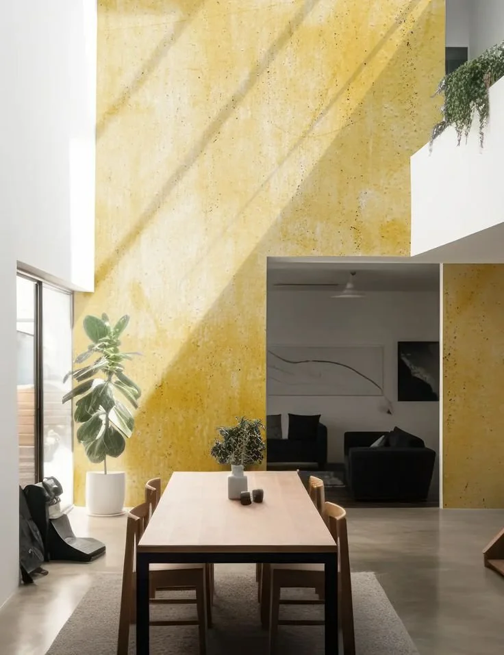
For the Home
When it comes to the home, butter yellow brings a little extra sunshine and vibes. It can be the go-to for a warm, inviting atmosphere, no matter how much you actually utilize the color.
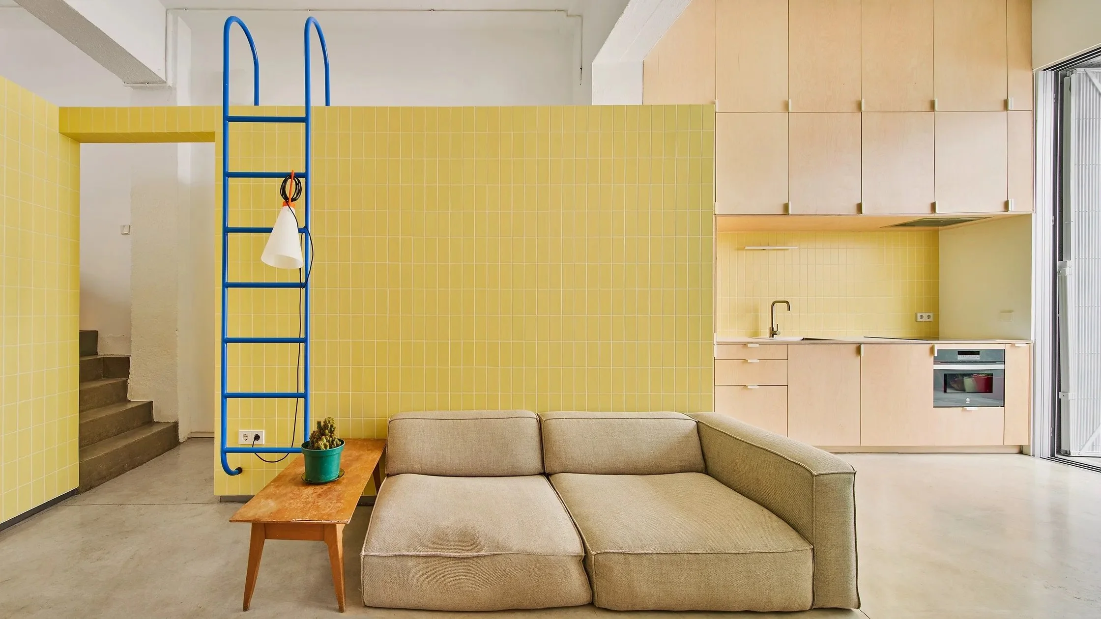
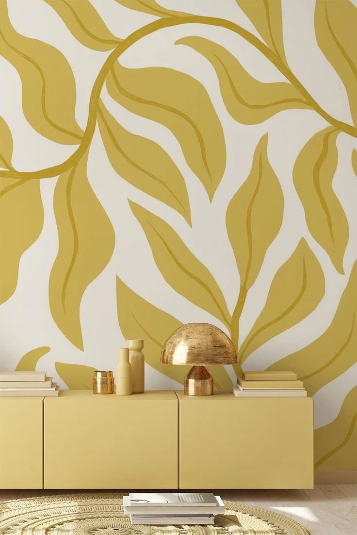
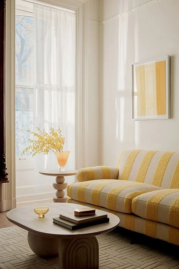
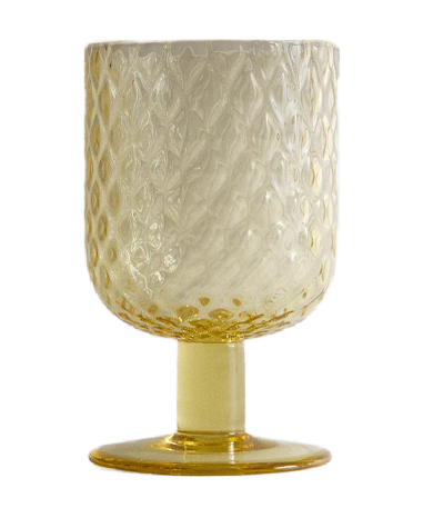
Accent Walls + Decor - There really isn’t a reason to make a full commitment to a yellow room. Starting small with an accent wall can meet the moment too. Butter yellow pairs seamlessly with neutrals like white, grey, and even softer shades of blue so adding items like throw pillows, vases, or a lamp, can brighten up the space.
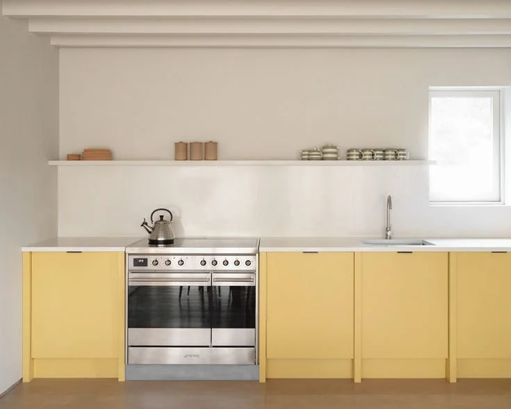
Kitchen - Butter yellow can make your kitchen pop through painted cabinets, backsplash, or, if you’re willing, vintage-inspired appliances. Honestly, adding yellow is a total nod to the retro vibes when no color was out of bounds but these days vintage-inspired pieces are more modern and fresh than kitschy.
Textiles - One of the easiest ways to introduce butter yellow is through textiles. Throw blankets, curtains, and plush area rugs can tie the room together and serve as an instant mood-lifter.
Outdoor Spaces - Even outdoor spaces can use a little extra sunshine. Butter yellow patio furniture, cushions, and decor can transform your outdoor space into an extra sunny retreat. It’s perfect for a summer lounging or enjoying some al fresco dining.

Decorilla2w
Architectual Digest


Dwell

Decorilla

Dwell

Decorilla

Dwell


In Your Style
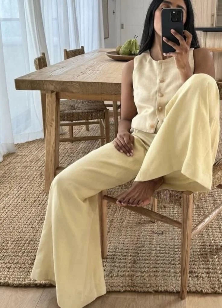
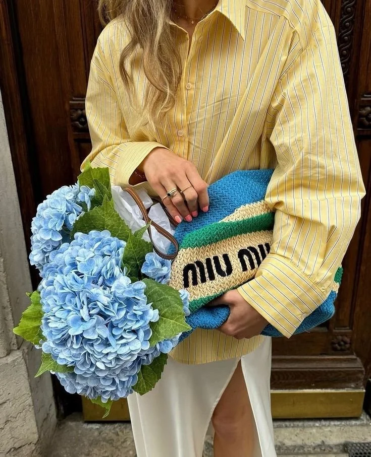
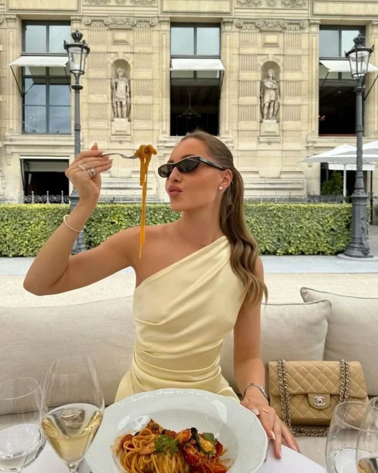
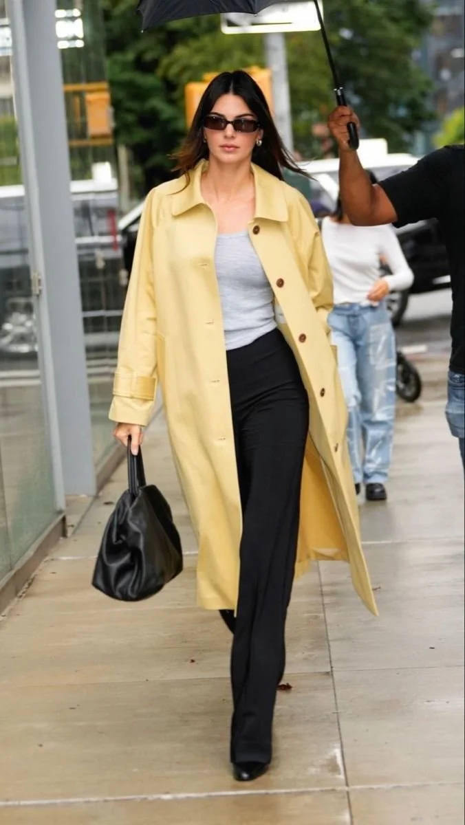
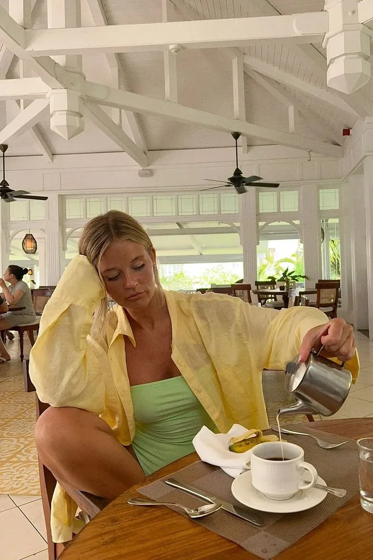
The fashion world and style set have fully embraced butter yellow. It’s subtle chic and playful elegance work whether you’re a minimalist or love a pop of color. These days it’s easier than ever to add this trend to your style.
Statement Pieces - Make a statement on a sunny day with a butter yellow dress. A chic, flattering, dress that pairs with gold accessories can give you the perfect sun-kissed look.
Layers - If you need a softer approach, layer butter yellow tops under blazers and cardigans. It’s a unique way to keep the trend alive evne if you’re not super bold.
Accessories - A full head to low look can feel like too much. Starting small with accessories like a handbag, scarf, or even shoes can add just the right amount without going overboard.
Mix and Match: Butter yellow is just one of those colors that blends well with other colors. Pairing it with other pastels can give a light, airy look, and when you’re trying to be bold, mix it with rich shades like emberald green or deep-blue.