Exploring Pantone's Chic Color of the Year: Peach Fuzz

Pantone's annual Color of the Year announcement always sparks excitement and anticipation in the design and fashion world. I always love getting to see the unexpected colors being chosen. For the 25th anniversary, Pantone has unveiled a stunning and unexpected choice: 13-1023 Peach Fuzz, a velvety peach tone that captures the essence of nurturing ourselves and others.
Described as a “cheerful yet serene mix of pink and orange,” Peach Fuzz goes beyond being a mere color; it's a representation of our “collective desire for compassion, kindness, and peace in a world facing various challenges.” In contrast to last year's bold and expressive Viva Magenta, this year's choice is much more tranquil and optimistic.
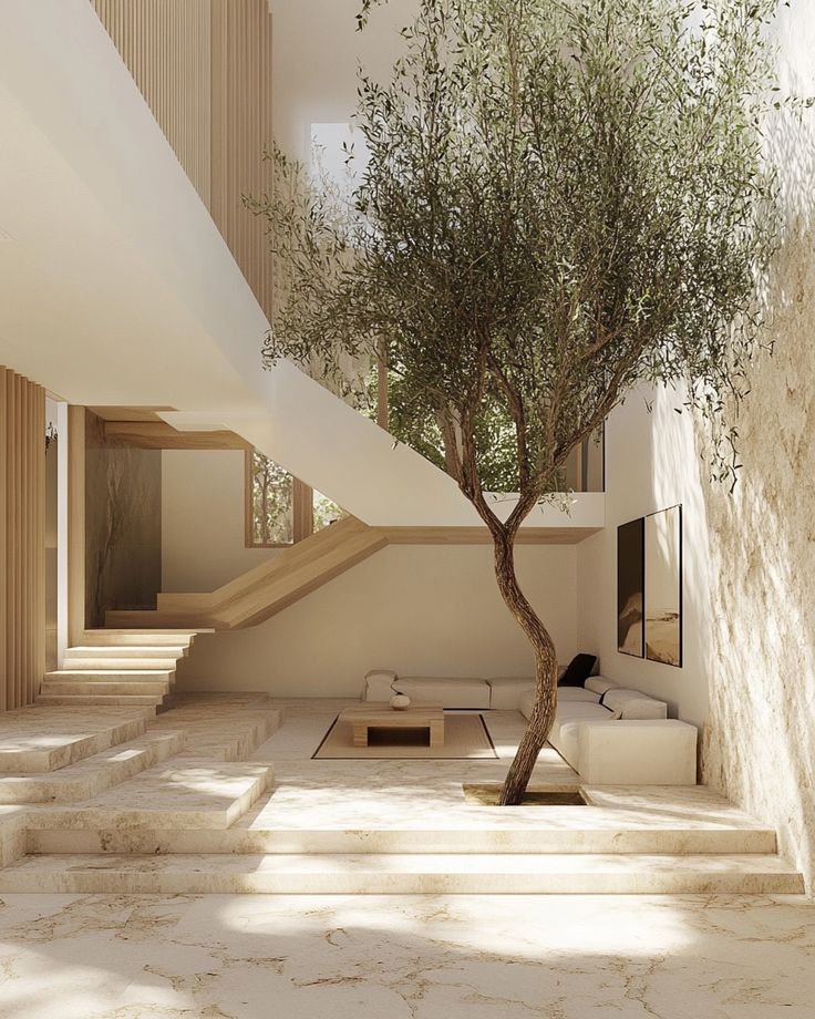
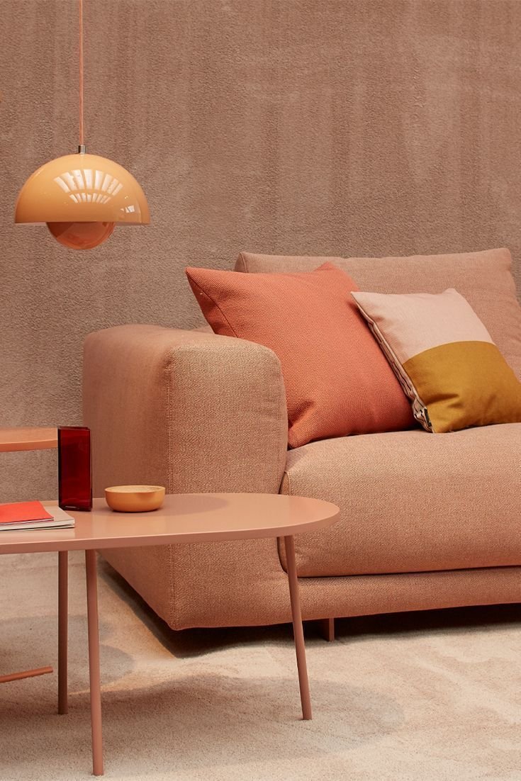
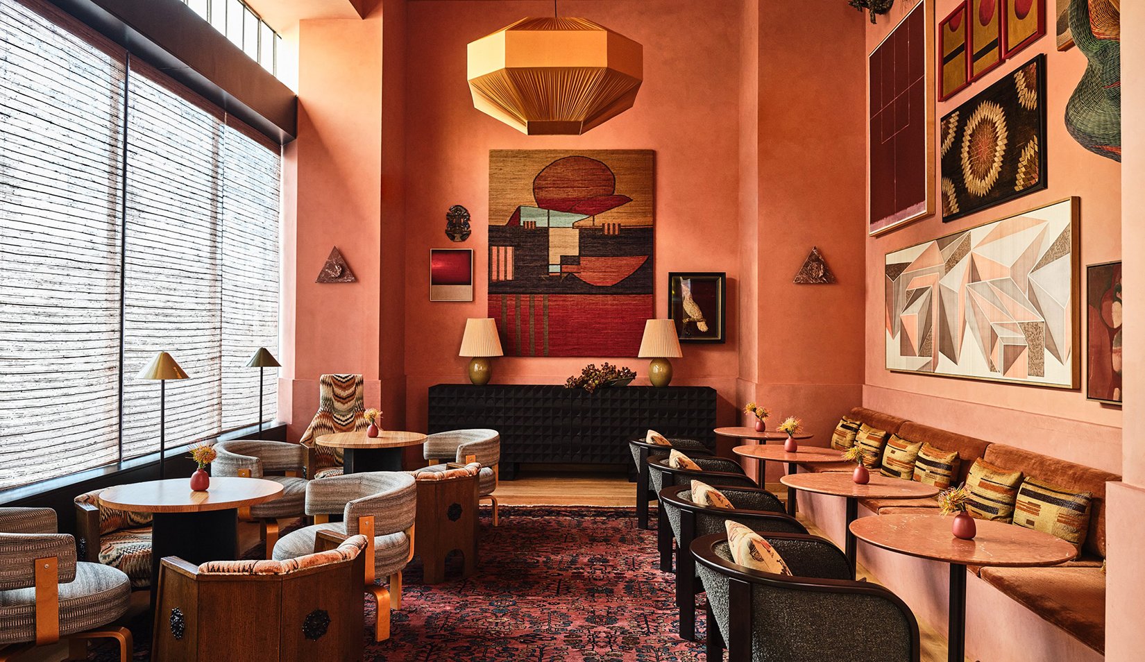
Peach Fuzz feels like an invitation to create spaces that foster rest, nourishment, and emotional rejuvenation. Pantone suggests incorporating it into bedrooms and dining rooms, and areas dedicated to relaxation and well-being. The choice of Peach Fuzz aligns with the global need for optimism and gentle energy, making it a perfect addition to spaces where we seek solace and peace.
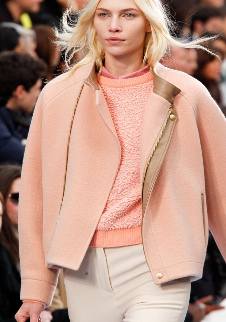
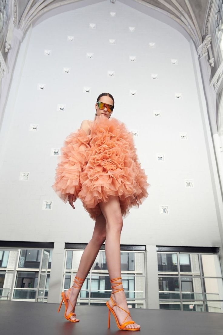
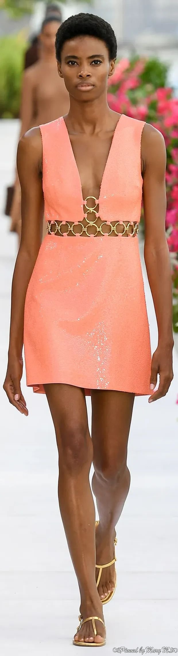
When it comes to fashion and beauty, it has been a color that has hit many of the spring 2024 runways from Alaia to Balmain. It’s a color that may not seem very versatile, but it really can be incorporated into a variety of fashion styles, from casual wear to elegant evening ensembles. Peach Fuzz effortlessly bridges the youthful with the timeless, offering a fresh and contemporary twist while maintaining a sense of classic charm. It can be used as a subtle accent, but as you can see below, it should be the main event. Peach fuzz is a color that is vibrant with a hint of sophistication and begging to be the center of attention. It’s a refreshing alternative to the often bold and expressive fashion world.


As we embark on the 25th anniversary of Pantone's Color of the Year initiative, it's evident that their influence on global culture remains unparalleled. From the introduction of Cerulean Blue in 1999 to the current choice of Peach Fuzz, Pantone continues to shape our perception of color and its significance in our lives.
In a year where blue is expected to have a major renaissance, Pantone's choice of a warm, orangey-pink color defies expectations. Peach Fuzz represents a departure from the cool, soothing shades commonly associated with tranquility, offering a vibrant and comforting alternative. As we embrace this unique color, we not only celebrate its aesthetic appeal but also the underlying message of compassion and the universal desire for a brighter, more peaceful world.
I honestly love the choice because I think it’s a gorgeous color. I have spent what feels like hours looking at a million photos real or generated by AI that show how this color can be utilized and how it’s been making waves already. I collected some of my favorites and ways for you to get the look right now.

INTERIORS


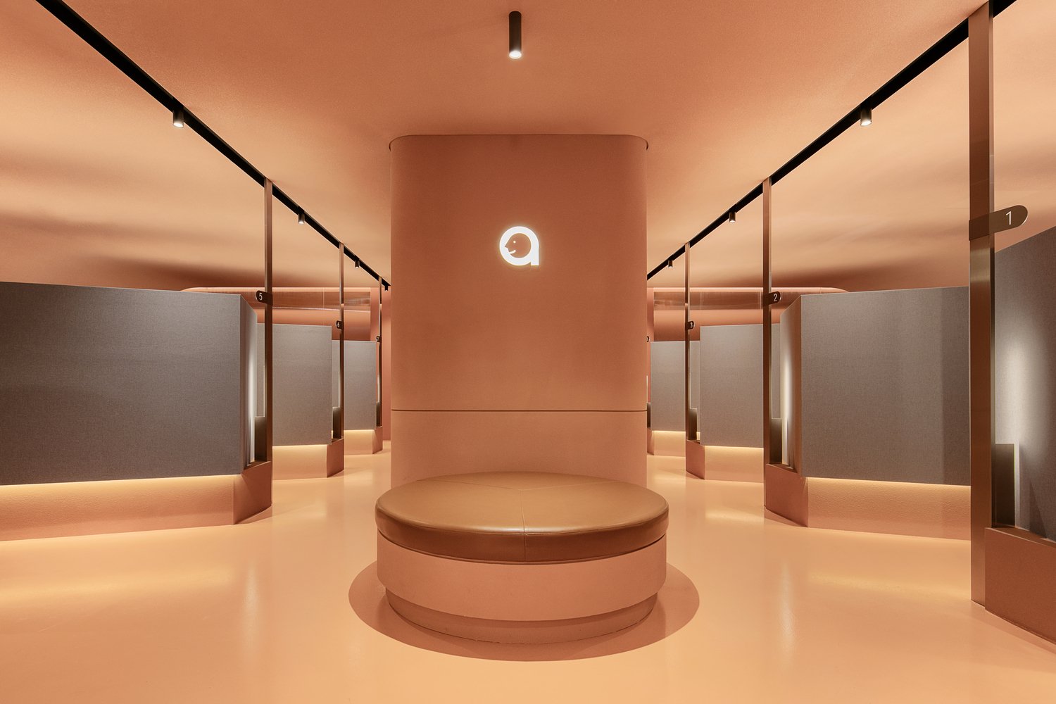
ATOP Beauty Clinic
GET THE LOOK


FASHION + BEAUTY


GET THE LOOK